

Judging Books by Their Covers
- Cal Black
- Feb 18, 2024
- 6 min read

Warning! This is a controversial topic! People get upset when someone hints that their covers are not excellent, even if they're... not. Before you read on, it is important to accept that the commentary below is from a) a design standpoint, which is different than art, and b) a business standpoint.
Who is Cal Black Anyway? Ew.
Hi, I'm Cal and I have a degree in multi-media design. Technically, interactive media, but the tech side changes so fast that I'm essentially out of date there. The design stuff changes on the tool side, but the fundamentals of design are timeless. While I've had experience and formal education, I fully admit I'm no expert. Experts charge money for this kind of stuff.

All examples of covers that need adjusting are examples I've made specifically for this purpose. I will not be using any negative examples from other writers because I don't want to single anyone out. All examples will be inspired by covers I've seen over the years in the community both online and in person, none will be inspired by a single cover. These issues are relatively widespread and can easily be fixed.
What this Post Is (And What It Isn't)
This post is to help writers who may be lacking a familiarity with graphic design to spot common pitfalls that prevent their book from reaching the audience it's meant to.
This post is NOT to shame anyone with a cover that exhibits any of the issues I discuss below. Nor is this post a replacement for studying graphic design through tutorials or courses. Consider this a jumping off point for anyone who isn't sure where to start.
Isn't this Gate Keeping?
Nope. You can absolutely still publish your book with whatever cover you'd like. However here's what may happen:
a reader loves cozy fantasy, and sees your cover with it's grim filter and assumes it's not a good fit for them.
a reader sees your cover which they perceive to be unprofessional or sloppy. They assume that if the author couldn't be bothered to spend the time on the cover to make it look appealing, the same holds true with the book's contents.
a reader picks up your book expecting one type of story and is blindsided by a very different one. They are unhappy and leave a negative review.
That's all stuff we can avoid with a bit of knowledge and a few tricks that I'll get into below.
Art vs Design
Art is the creation of something that expresses human emotion or experience through a type of media, like visual art, music, dance, theatre. Art can be created with no viewer in mind, as the process of creating art expresses the artist's intentions.

(Graphic) Design is the process of using visual art and text to communicate an idea or data to the viewer. Graphic design is explicitly created with a viewer in mind, while design can be applied to building plans for a project. Both are focused on communicating to a viewer, whether it is a reader or the constructors of said project.

Book covers use art, but are graphic design by nature. This is important when it comes to evaluating if your cover is effective or not. You can love a cover, but if it is not communicating the idea of the book to viewers who are not you, it will not be effective in attracting readers.
Business Jargon and Stuff
If you want to make books purely for yourself, then you don't need this blog entry. If you want to make sales, then you need to communicate to potential readers the following things:
what the book is called
who wrote the book
what the reader can expect from the book
Target Markets are groups of people that share certain traits. By identifying who your main market is, you can tailor your cover to be more appealing to the readers you want to reach. Different markets respond to different visual cues, which you'll need to understand if you want to show these potential readers that your book is for them.
Design Basics Anyone Can Use
Contrast
Remember that not all readers will see colours the way you do. A really easy way to see if your cover is still easy to read is to turn it to greyscale. Try to choose colours that are a different value (brightness) to make it stand out.


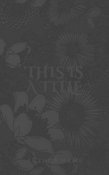


In the example above, the first cover on the left has a busy background with purple text that difficult to read. The second image shows the desaturated (greyscale) version of that cover and how the purple title is actually quite close in value (brightness) to the green petals even though they're different hues (colours).
The third image on the right is an easy fix for covers like this. By changing the font to white, the font is immediately easier to read. Adding a dark outline to the text is an additional step that helps the font stand out even more from the busy background of the cover.
To see effective versions of this, I grabbed this year's finalist collage of Mark Laurence's SPFBO contest and desaturated them in photoshop.

Each book is relatively easy to read even at a thumbnail size, even though some have metallic effects applied to them, or use a very decorative font.
Balance
Repeat after me: Balance does not equal symmetry.
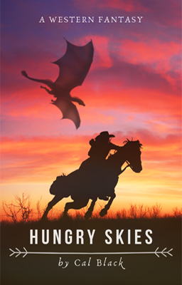
I'm going to use one of the covers from SPFBO for this because it's a great example of balancing art with the title. The cover for CM Caplan's novel The Fall is All There Is has the rider and horse offset to the left, creating an empty space to the right. This space is then used for the title, which is spaced out to feel 'lighter' than the 'heavy' image of the rider and his horse. Yet the composition feels balanced because the importance of the title and the fact that it's text evens out the visual discrepancy. If you want to learn more about this, check out the terms 'gestalt' and 'balance' in graphic design.

Things to Avoid
I'm going to upset people with this, but I cannot overstate how much this one thing turns potential readers off. These readers are often too polite to say the reason, so I'm ripping the bandaid off so we can all be honest and open about how to improve our author-reader communication.
Unless you are a professional artist or regularly making money from commissions, do NOT draw/paint your own cover art.
To get the usual arguments out of the way:
Yes, I know you like it.
I know your parent/spouse/friend/cat says it's good. They mean it, too.
If you put your book on the shelf in your local bookstore, it will stand out and not in a good way.
Yes, you can still go ahead and put your drawings on your books, no one is stopping you. However you will also lose sales to readers who think the book is unprofessional.


I'm sharing the very first covers of what would become No Land for Heroes to help illustrate this point. I'm not a professional artist, and I know with time and practive I could improve my skills to be confident enough to use my own art for the covers. But my illustration in the middle is visibly less developed than the one I ended up using for No Land for Heroes. It was fine for wattpad, but if I wanted to sell this book for actual money, I'd either need to spend months improving my skills or pay a pro. I paid the pro so I could focus on polishing the story.


Here's another example of a drawn cover and two other options that are entirely pulled from canva. (Just be wary of the AI generated images in their media library, but that's another post). The drawing here isn't as bad as others I've seen, but the shading on the umbrella and clothing are what makes it feel amateurish.
Bright Yellow and Green (or Blue) Text on Black
This is a personal pet peeve because it hurts my eyes. True Blue on black hurts. Don't do that to your readers.
Black Bars
Sometimes you find the perfect image and it's just too horizontal to fit properly on a vertical book. Unfortunately adding horizontal bars of colour make the book look like it's a text book, or... like you couldn't find a better image. If you can't find a crop that makes you happy, reach out to a cover designer and see if they'd be able to modify the image with a different background.
Unrelated Image
This issue opens up a can of worms that might be better suited for a different post, but here's the short version. Your book should communicate what readers should expect from it. Having a title like 'sword' with something like a glowy egg [yes these are very simple examples] leaves the reader unsure what this book is actually about. This issue mostly shows up with 'vibes', making it harder to pinpoint. But if your book is a dark fantasy, a glowy egg might not fit if its vibrant and ethereal. Instead, adjusting the filter on an image can go a long way to setting the right expectations for your readers.


Remember, this is all to help you get your book into the hands of readers. You can break any of these guidelines, but it's best to understand why they exist in the first place so you know exactly how to break them in order to get the result you want.
Wishing you all the best, but it's time I get back to writing my current wip or my cat will be upset.
Cal & Cat
Comments